My wife designed our logo. I taught an AI to make it move.
A loading animation does not deserve a system. Unless the thing loading is the symbol your whole brand stands on. Here is the full build: one prompt, a deeply wired AI workspace, and 18 production animations that all hold the brand law.
The week before we graduated film school at the University of Colorado Denver, two of my buddies and I cornered one of our production professors and asked him the only question that actually mattered.
How do filmmakers make money?
He gave us a few good answers. A few obvious ones. And one quiet realization that has never left me: four years of film school had taught us how to make beautiful things and almost nothing about how to make a living.
That gap, between craft and a business that survives, is the thing I have been closing ever since.
If you only take one thing from this: the generic version loses. The systematized, extra-mile version wins. What you build is the system that lets you ship the non-generic at scale.
It started with a loading screen nobody asked me to fix
My wife designed the TRUERY logo.
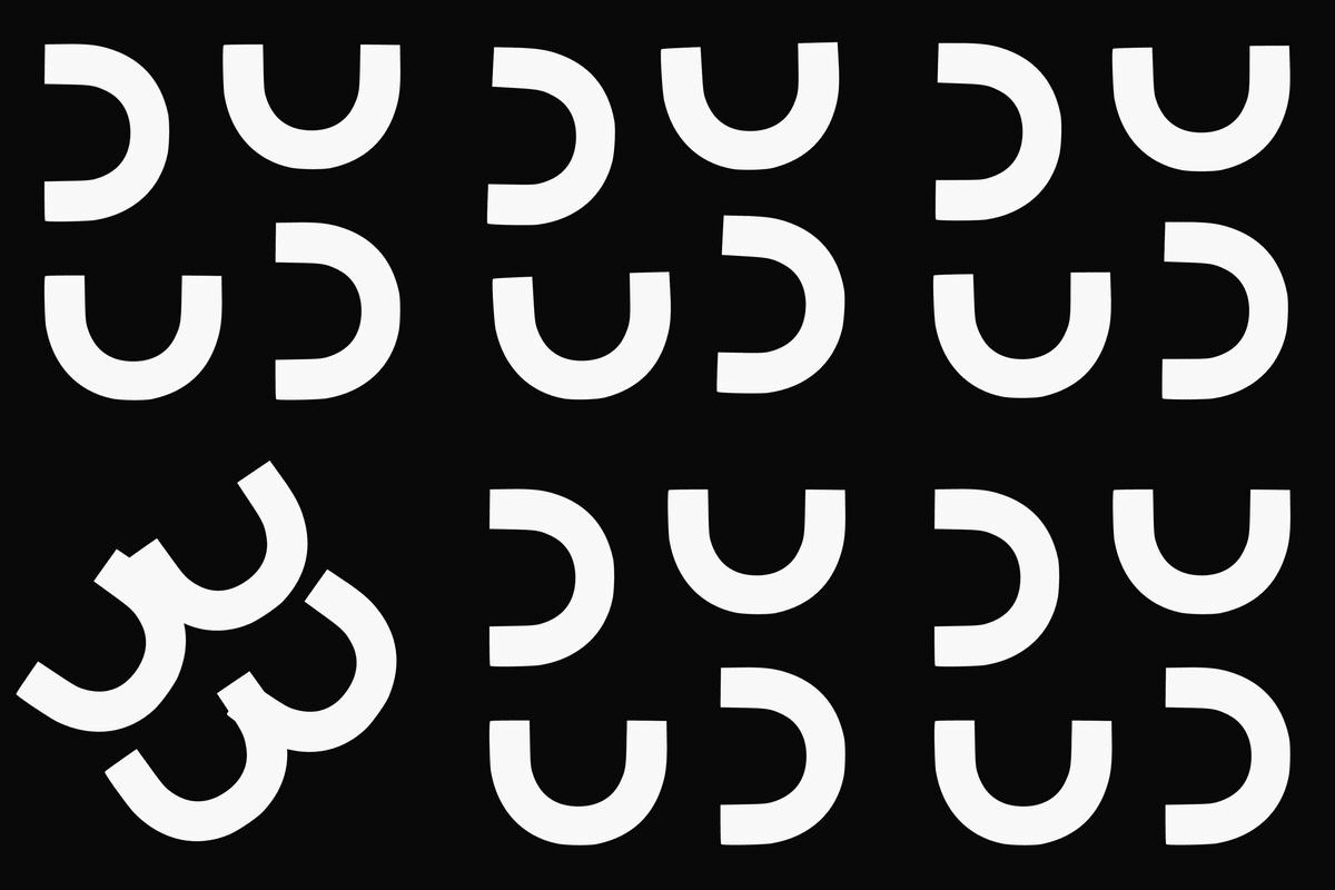
Four U shapes. A square that has no border, held together only by the way the four pieces hold their positions. The negative space in the middle is the point. A whole made of parts that each stay whole.
So when our homepage loader, the little animation where those U shapes shuffle clockwise, felt slightly off to me, it was not a small thing. It was her mark. The symbol the entire brand stands on.
A generic spinner is fine for a generic company. The mark deserved motion designed as carefully as the mark itself.
The unglamorous part nobody photographs: the workspace
Here is the part that makes this a real story instead of a demo.
I did not type one clever prompt into a blank chatbot and get magic. I typed one prompt into a workspace I had spent months wiring.
Before this build ever started, the AI already knew:
- Our exact brand law. White on near-black. No gold inside the mark. No glow, no filter, no added shapes. The four U paths, byte for byte. - The voice rules. Em dashes banned. Six structural sins to avoid. My real bio facts so it never inflates them. - Sixty-plus memory files.
Past decisions, gotchas, the way I like to work, the things that have burned me before. - A decomposition system for breaking big work into parts that each stand on their own. The same holon idea the logo is built on.
That context is the moat. Anyone can rent the same model I use. Almost nobody has spent the months building the environment that makes the model behave like a senior operator who already knows your brand.
This is the Upwork lesson again, scaled up.
What you build is the system that lets you ship the non-generic at scale.
George V.K.
The Upwork lesson
After eight years in corporate, producing same-day edits for Fortune 500 brands, I quit. Suddenly I was the whole funnel. Lead gen, nurture, close, discovery calls, fulfillment, delivery, retention. A flywheel that is brutally hard to keep spinning alone.
The turn came from a short video by a creator named Nick Saraev on optimizing an Upwork profile. I stopped sending the boring copy-paste cover letter everyone sends. I started sending a custom document, a recorded Loom, real research pulled from the job post.
Then I built AI agent flows that ingested the job description and generated all of it for me, so all I had to do was execute and send.
Close rate went to thirty, forty percent. Enough to stop scraping by and finally breathe.
The cover letter is the generic spinner. The custom Loom is the brand-correct animation. Same move, years apart: refuse the template, then build the system that makes the non-template repeatable.
People need to be reminded more than they need to be taught. > Alex Hormozi
One prompt, then a small army
The actual ask was short. Find the original build files. Launch a holonic-architecture workflow. Produce 12 or more standby animations with a real held pause on the locked mark. Keep the U a U. Smooth easing. Creativity at 100.
What happened next is the part worth understanding.
It fanned out instead of grinding
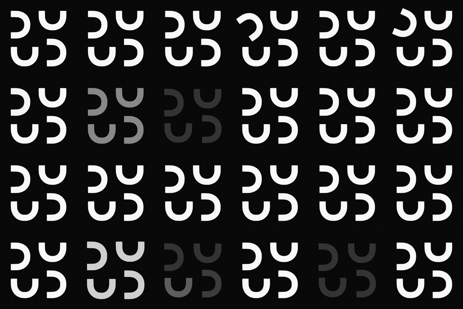
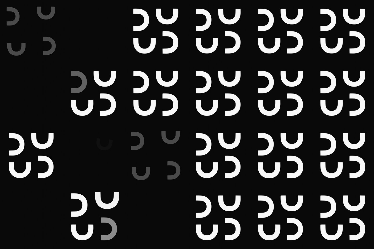
Instead of one model slowly drawing 18 animations, the work decomposed into lanes. Twelve loading contexts, each its own little holon: the splash, the button spinner, the favicon, the skeleton, the progress gauge, the video buffer, and more.
Each lane got built by one agent and then handed to a second agent whose only job was to try to break it. Real adversarial review. Does it use the actual logo geometry? Does the U ever morph? Is there a real held dwell? Is it brand-legal?
Then it all composed back into one display page.
The set covers every place a loading state actually lives: the splash, the route change, the button, the skeleton, the success check, the modal, the nav-logo hover, the cold-start standby, the toast, the view swap, the inline thinking dots, and the video buffer.
The detail that almost shipped wrong (and how we caught it)
Here is the moment the whole thing nearly went out subtly broken.
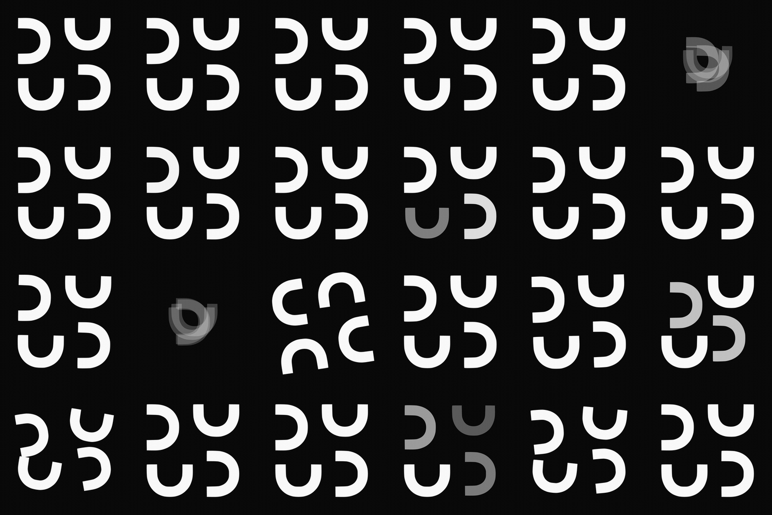
Three of the animations rebuild the mark by rotating one canonical U into each corner. To put a U in the top-left slot, you rotate it. The brand guideline said plus 90 degrees. The instruction I had given the agents said plus 90 degrees. Everything pointed to plus 90 degrees.
It was wrong. The top-left U came out mirrored.
I did not argue with it. I rendered every candidate against the real, vectorized logo file and measured the pixel difference. The right answer was a 19-pixel difference from the real logo. The wrong one was 1,576 pixels off. You cannot eyeball that at small sizes. You measure it.
The lesson for any founder using AI on brand work: do not trust the guideline, the model, or your own eye. Verify against the source of truth, in numbers. Brand law is geometry, and geometry is measurable.
Then we actually shipped it. Carefully.
A gallery is a demo. Production is a different animal, especially when one of the surfaces is the button that takes someone's money.
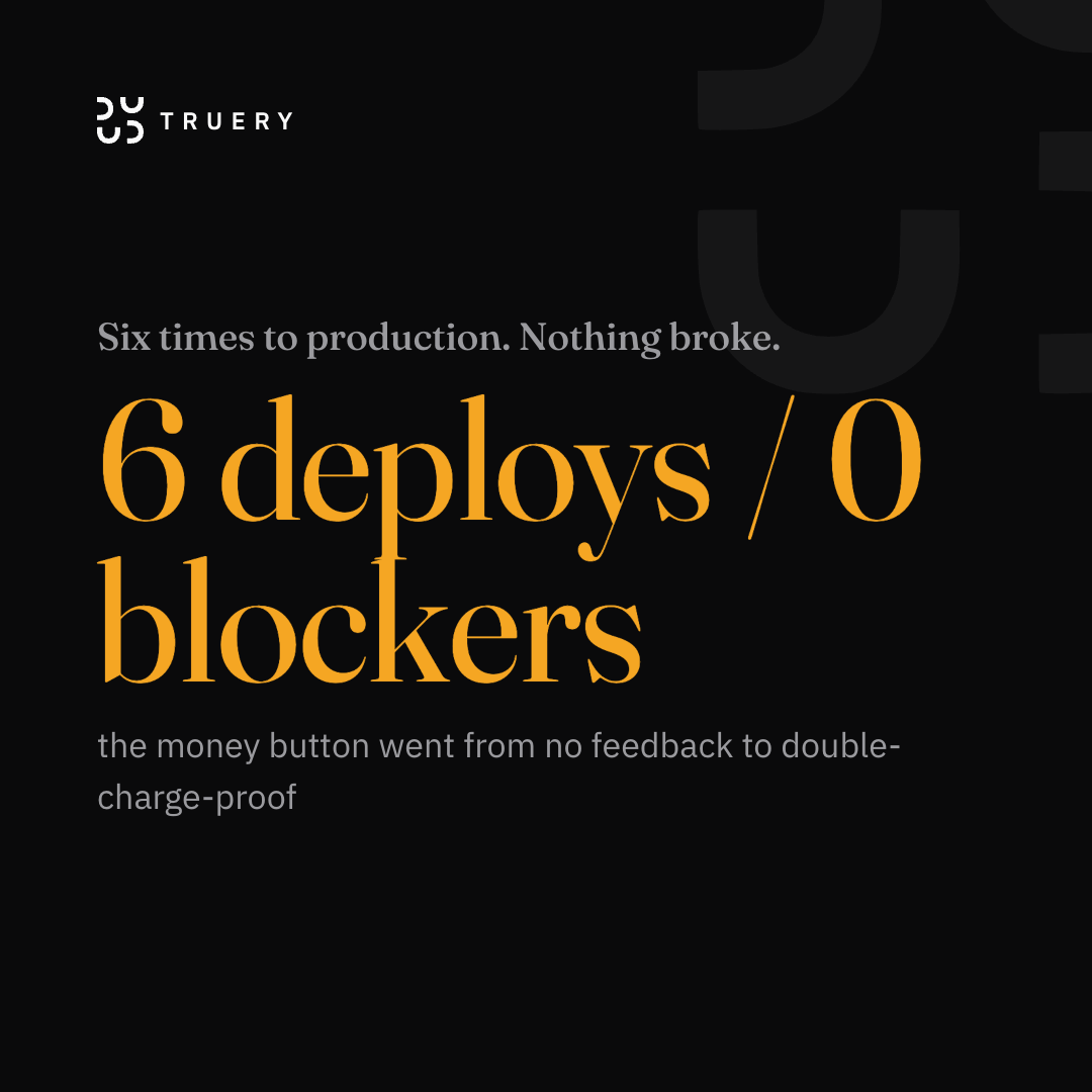
So it went out in six small batches, not one big push. Every batch was adversarially reviewed before it touched the live site. Every batch was a clean, isolated branch so I never stepped on another in-flight change. Every deploy waited at a gate for an explicit yes.
Six deploys. Zero blockers found at the gate. The money button went from no loading feedback at all to a hardened, double-charge-proof state.
The part I am most proud of is the part we did not build
The system designed 18 animations. The audit of the real site found that four of them had no honest home. No pull-to-refresh existed. No idle kiosk screen. No file upload. No favicon-animation mechanism.
So we did not build placements for them. They sit in the library, unused, on purpose.
Refusing to fabricate a use case is the same discipline as refusing to fabricate a number in a bio. The restraint is the brand.
What a founder should actually take from this
1. Invest in the workspace, not the prompt
The prompt was three sentences. The workspace behind it took months. Brand law, voice rules, memory, SOPs, all wired in first. The edge is almost entirely in the setup. Build the environment once. Then your prompts get to be short.
2. Make something try to break everything
One model that builds and grades its own work is a fox guarding a henhouse. Pair every builder with an adversary. The orientation bug, the stuck loaders, the money-button edge cases. An adversarial second pass caught all of them before a user did.
A model that grades its own work is a fox guarding a henhouse.
George V.K.
3. Refuse the generic, then systematize the non-generic
A brand-correct loader is no harder to ship than an amber spinner once you have the system. The Upwork proposal is no harder to send than the copy-paste cover letter once the agent builds it. Do the work once to make the better version repeatable.
4. Motion is punctuation, not decoration
Every animation holds a real, motionless beat on the locked mark. The held beat is when the brand actually reads. We resisted putting a loader on every micro-wait. A loader everywhere is wallpaper. A loader where it counts is a signal.
The prompt, cleaned up so you can steal it
Here is a polished version of what kicked this off. It works because of everything behind it, but the shape is reusable. Notice it gives a clear job, hard constraints (the U stays a U), a creativity dial, and a concrete deliverable.
Find the original raw build files for our logomark loading animation. It is the
one where the U shapes of the square logo mark animate in a clockwise direction,
replacing each other. It is the homepage loading screen.

Then launch a holonic-architecture-style workflow to produce 12+ standby/loading
animations with a real dwell (a held pause) on the locked logo mark. The set
should cover every way the mark could be embedded across the site, the app, and
any loading state I am not thinking of.

Rules:
- Smooth ease-in-ease-out curves.
- The U shape is maintained throughout. Never morph it into something it is not.
- Creativity dialed to 100.

Present the final variations in a nicely designed HTML display page.
Swap in your own mark, your own constraints, your own brand law. The structure travels.
Questions people ask about this
What is a brand motion system?
A brand motion system is a documented set of animations that all obey the same brand law (geometry, color, easing, timing) so the brand reads consistently across every loading, standby, and transition state. It is to motion what a logo lockup sheet is to a static identity.
In this build it is 18 logomark animations plus a reusable component, all built from the same four-U geometry.
Can AI design on-brand animations?
Yes, when the AI is given the real brand law as hard constraints and its output is adversarially verified against the source files. AI does not invent good taste. It executes a well-specified standard at scale and catches its own drift if you make a second pass try to break the first. The risk is not creativity.
The risk is unverified geometry, which is why every animation here was pixel-checked against the real logo.
How were the animations built, Claude or Remotion?
Both, at different stages. The original homepage loader was built in Remotion. The 18-state system was generated and verified by Claude inside a heavily configured workspace, then shipped as self-contained CSS and SVG components that drop into a React and framer-motion site.
The geometry is byte-identical to the production logo paths in either tool.
Why does a loading animation need a held pause?
Because the held beat is the moment the brand actually registers. Motion that never rests reads as noise. Every animation in the system holds the locked mark motionless for at least 1.4 seconds, so the symbol lands before the content arrives. Motion is punctuation around the held statement, not the statement itself.
What is holonic decomposition?
Breaking a large task into parts that each stand on their own (holons) and also compose into the whole, the same structure the TRUERY mark is built on. Here, one prompt fanned out into independent animation lanes, each built and adversarially verified on its own, then composed back into one system.
It is how you keep quality high while parallelizing.
If your brand deserves this kind of rigor
I write about building a brand like a system. The craft, the operating principles, and the unglamorous setup work that makes the output look effortless. No pitch. Just the next one of these in your inbox.
STORY HARDER. GROW STRONGER. LIVE BETTER.
George V.K., founder, TRUERY