Are Websites Still Relevant in the Age of AI?
Yes. A website now has two readers, the human who feels it and the AI that reads it, and most sites are built for neither. Websites got more relevant. The job got harder. Here is how I found out on my own site.
I run an agency that finds the one true thing only you can say. My own homepage had a dozen animation effects, three testimonial widgets, and a hidden game where you could catch falling dollar signs.
It sounded like every agency on earth.
My homepage was doing every job at once
Every pitch I make starts the same way. Your product is excellent. Your story sounds like everyone else.
Then I audited truery.com.
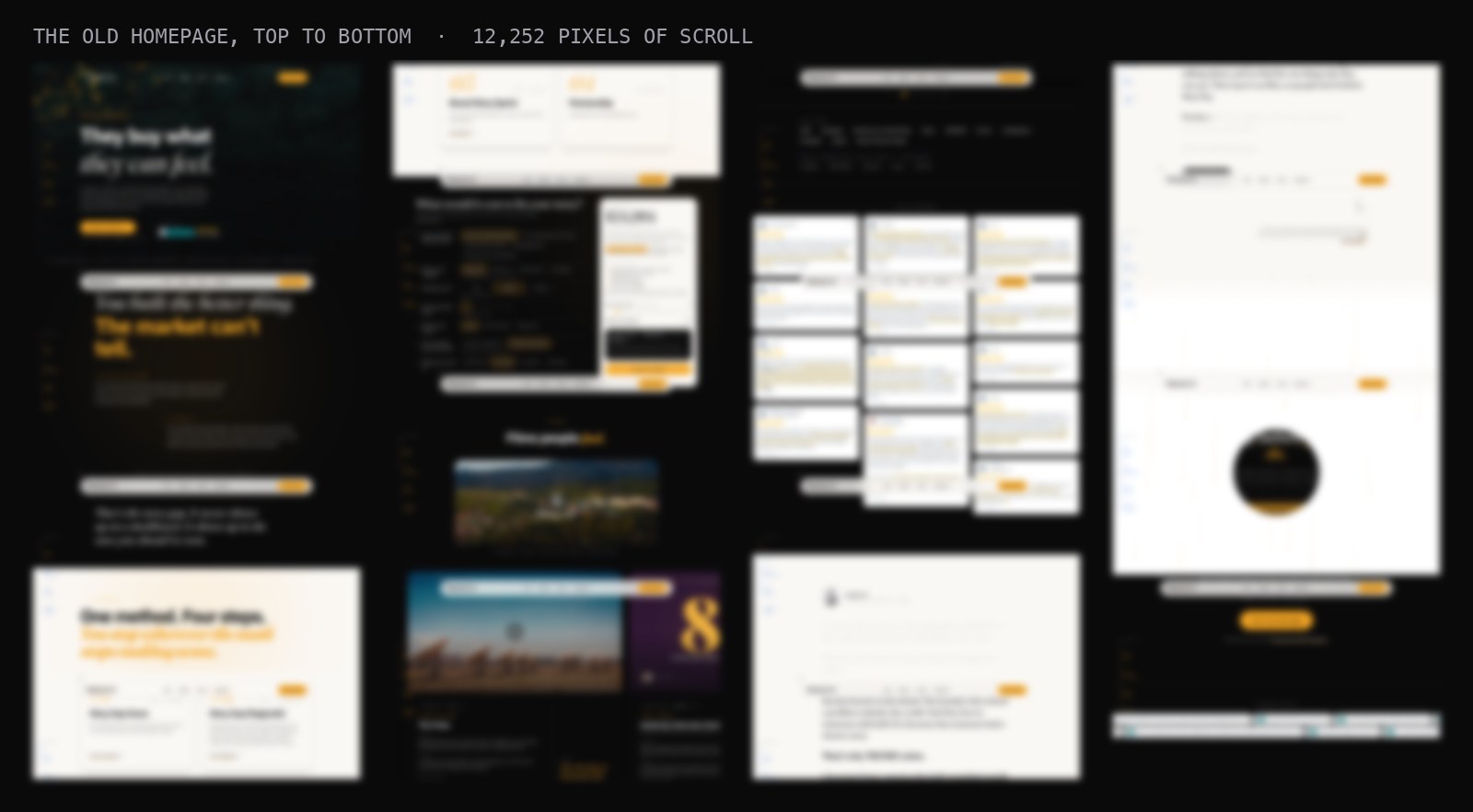
A dozen animation effects, several of them dead code nobody had removed. Three separate testimonial widgets stacked on one scroll. A long stretch of the page, the longest stretch, with no way to act on anything. And a hidden mini-game where falling dollar signs rained down and you could click to catch them.
I had written a brief calling it "an overdeveloped theater of animations and graphical elements." That is a polite way of saying I had built theater. The company that diagnoses sameness for a living had it.
The deeper problem was structural. It was the only page. Someone hearing about TRUERY for the first time and a buyer ready to sign landed in the same place, and both got everything at once.
That is the story gap. Everyone has one. Mine was on my own front door.
Your homepage has two readers now
Here is what actually changed, and it is bigger than "people use ChatGPT now."
A website used to have one reader. A person, with eyes, who could feel a page.
It now has two.
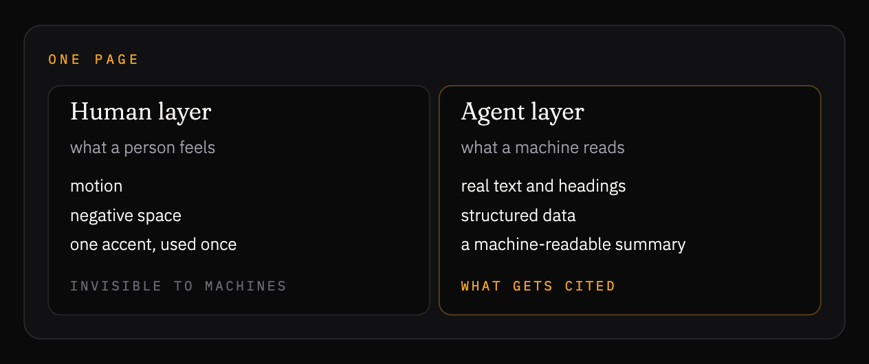
The second reader is a machine. An answer engine that decides whether to cite you when a buyer asks it a question. And that machine cannot see your hero animation. It cannot see your video. It cannot see 3D. It reads text. Headings. Structured data. A plain summary you wrote for it.
So an animated homepage is a locked door to the reader who now decides half your discovery.
I call this The Two-Reader Website. The human layer is the experience: motion, space, one accent. The agent layer is the argument: real text, headings, structured data, a machine-readable summary. Same page. Two surfaces.
Most sites serve neither. They give the human theater and the machine a wall.
The AI handed me three clever concepts. I killed all three.
I left the homepage alone and decided to build a landing page beside it with AI. One job: say the one true thing to someone who has never heard of us. I asked for something out of this world.
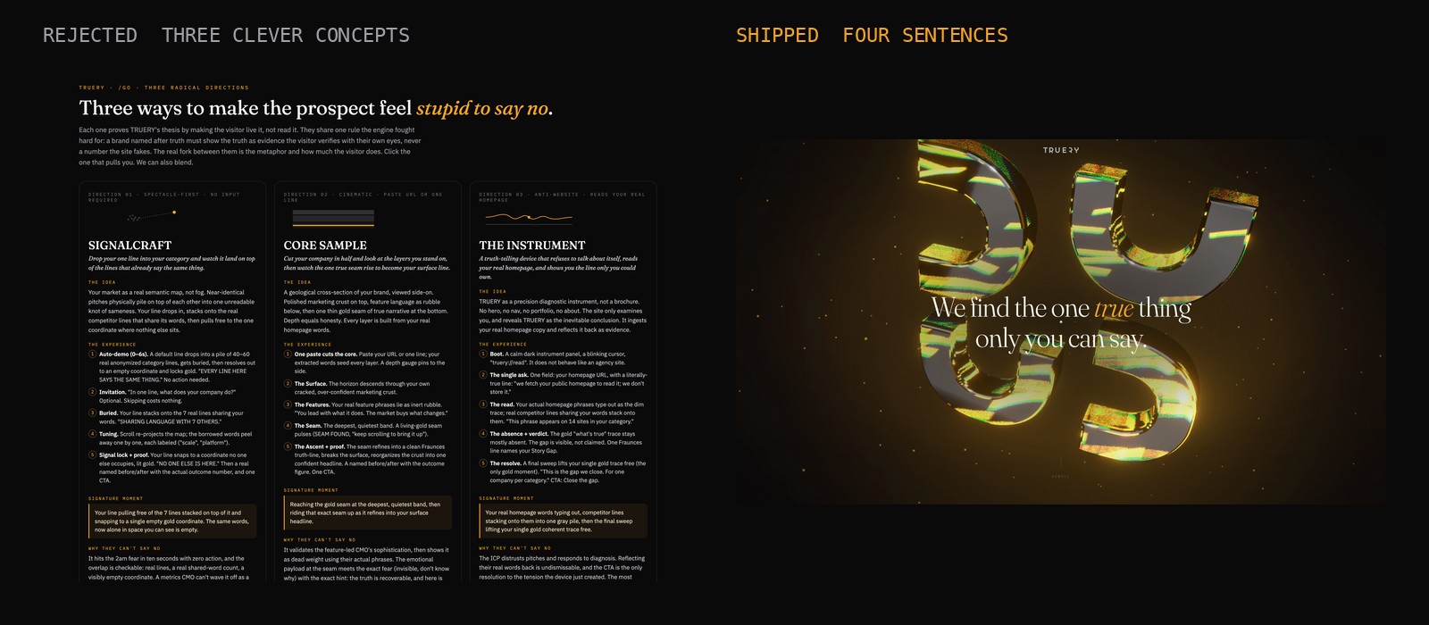
It delivered. Three elaborate concepts came back. A semantic map of your whole category, where your tagline physically piles onto the competitors saying the same thing. A geological cross-section of your brand you scroll down through. A diagnostic instrument that reads your homepage and prints a verdict.
Clever. Genuinely clever. And I told it exactly what I thought:
These options are way too convoluted, complicated, too involved, too trying to be smart and clever. It needs to be simple. It needs to be absolutely zero brains needed to understand. It needs to be so simple that it's beautiful. The clarity part needs to come through.
The next version was four sentences on a black screen. One warm glow. Gold on a single word.
Your product is excellent.
Your story sounds like everyone else.
We find the one true thing only you can say.
And turn it into why they choose you.
That's the concept. That is the whole landing page, live at truery.com/go. Four sentences and one button.
The homepage stayed. It still does its job: the films, the proof, the pricing, the testimonials, everything a buyer who is already evaluating wants to dig through. That is a library, and a library is supposed to hold everything.
Someone meeting TRUERY for the first time needs one claim, said once. So the landing page does that one job and hands off to the Story Gap Score. Two pages. Two jobs. Each one gets better because it stops doing the other one's work.
Here is the lesson, and it is the one most people get backwards. AI defaults to clever. It will always reach for the elaborate version, because elaborate looks like effort. Your job is to be the outside eye and cut.
The closer you are, the worse you cut
I know this rule from the edit bay, and I still break it.
When I edit, I am so close to the footage that I want to use every shot I captured on set. That makes it hard to let go of the shots that are mediocre. I like them. I am emotional about what happened while capturing them.
Watch the edit with someone from the outside and it becomes obvious which shots truly stand out and which can go. The piece gets better for being pared down. Lean. Simple. Dug down to the core of the truth of what it is supposed to be.
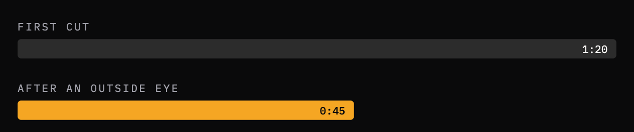
This just happened on a shoot for a hotel brand in New York City. Their perspective let me cut the brand hero film from a minute twenty down to forty-five seconds. Self-contained. Narrowly focused. More powerful for it.
Separate yourself from the work at every stage it takes to build it. A film. A homepage. A pitch. The maker closest to the material cuts worst.
On this build, I was the outside eye on the machine's edit. Same rule. It was holding onto its favorite shots.
Hand the machine your real logo
One more thing AI got wrong, and it matters for anyone letting a model near their brand.
I asked for our logomark, the four U shapes, as a 3D object. The AI rebuilt it from scratch. I looked at it and said: I don't know what those shapes are, but that's not the TRUERY logomark. It tried again. Upside down.
It got it right the moment I handed it the real geometry and told it to stop redrawing.
Do not let AI rebuild your identity. Hand it the true asset. The real mark, the real words, the real numbers. It will fill any gap you leave with a confident approximation, and an approximation of your logo is a stranger wearing your name.

Tests catch logic. Review catches the bug that costs you the visitor.
The AI built the real page task by task and wrote tests for every piece of logic. Thirteen passed. Build green. Everything looked done.
Then I had a second AI review the first one's work adversarially, told to assume there were bugs and find them.
It found one the tests could never see. The closing button, the one that sends you to the Story Gap Score, was rendered invisible during the opening lines but was still sitting over the center of the screen. Any curious click near the middle of the page would have silently thrown the visitor out to the quiz before they read a word.
Thirteen passing tests. One bug that would have quietly broken the entire experience. Caught only by a second pair of eyes.
Then the preview on a real screen caught something else: the AI had over-lit the glow around the mark, and it flooded the page in gold with a hard edge. On the machine's own render it looked fine. On a real display it looked wrong. Dialed back. Shipped.
The pattern is the whole point of this piece. Build with the machine. Never trust the machine's opinion of its own work. Get the outside eye, then verify where it will actually be seen.

What shipped
The landing page is live at truery.com/go, next to the homepage. A human scrolls four sentences and one button, with the glass mark turning behind them. Keep scrolling past the last line and it hands you straight to the Story Gap Score.
Underneath, the same four sentences exist as real text with structured data and a machine-readable summary, so an answer engine reads the full argument and can quote it. The 3D layer only runs where it can. Every phone and every crawler gets the four lines.
One page. Both readers. The simplest thing TRUERY has ever shipped is also the first thing it has shipped that a machine can read start to finish.
Five things to take back to your own site
- Your website has two readers now. The human layer is the experience. The agent layer is the text and the structured data. Build both or you built half a site.
- AI defaults to clever. Your job is to cut. Three elaborate concepts, all rejected. Four sentences shipped. The outside eye decides.
- The closer you are, the worse you cut. A minute twenty became forty-five seconds because someone else could see the shots. Separate yourself from the work at every stage.
- Hand AI the true asset. Wrong twice from scratch. Right immediately from the real geometry. Do not let it rebuild your identity.
- Tests catch logic. Review catches the expensive bug. Thirteen green tests and one invisible button. Then verify on the screen it will actually be seen on.
The Two-Reader Test
Run this on your homepage today. It takes a minute.
Cover the visuals. Read only the text. Does the argument survive? Could a machine quote your one true claim from what is left?
Cover the text. Look only at the experience. Does a human feel anything? Or is it theater?
Fail either and you built half a site.
Steal the brief
This is the brief that produced the page, in my words, cleaned up so you can hand it to your own team or your own AI.
I don't want clever. It needs to be simple. Absolutely zero brains
needed to understand. So simple that it's beautiful. The clarity
has to come through.

One idea at a time. Huge negative space. One accent color, used
once, at the moment of truth.

Build it for two readers: the human who scrolls it, and the AI
that reads the text underneath. The visuals are for the human.
The argument has to survive as plain text with structured data,
or the machine reads nothing.

Reuse my real logo. Do not redraw it.

Then have a second reviewer try to break it before I see it.
Questions people ask
Are websites still relevant in the age of AI?
Yes. The job changed. A website now has two readers: the human who visits it and the AI answer engine that reads it. A site that serves both is more relevant than it has ever been. A site that serves neither is a brochure nobody reads.
Can AI answer engines read my homepage?
Only the text. Animations, video, and 3D are invisible to them. If your argument lives in the visuals, the machine reads nothing and cites someone else.
What is a two-reader website?
A site built so a human feels the experience and a machine reads the argument as plain text with structured data. Same page, two surfaces. The visuals serve the person. The text and schema serve the AI.
Should I make my website simpler for AI?
Simpler serves both readers. Four sentences a human can absorb are four sentences a machine can quote. Complexity hides the claim from both.
Can AI build a website?
Yes, with an outside eye. An AI built ours task by task. A second AI reviewed it and caught a bug the tests missed. A human cut its three clever concepts down to four sentences.
How do I test whether my site serves both readers?
Cover the visuals: does the argument survive as text? Cover the text: does a human feel it? Fail either and you built half a site.
Here's to your next story,
George V.K.